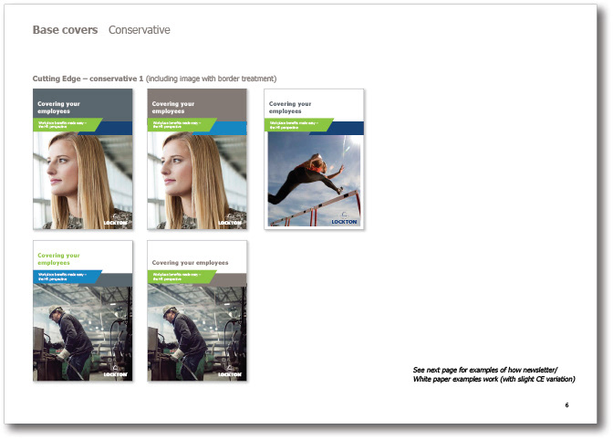
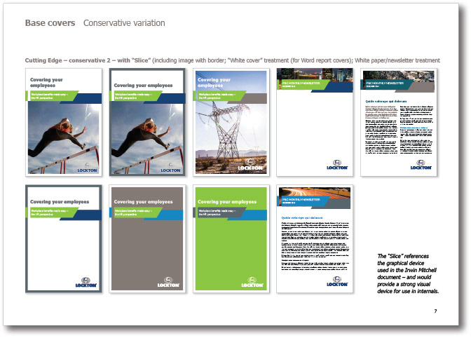
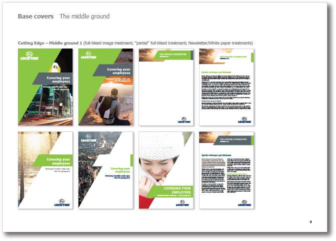
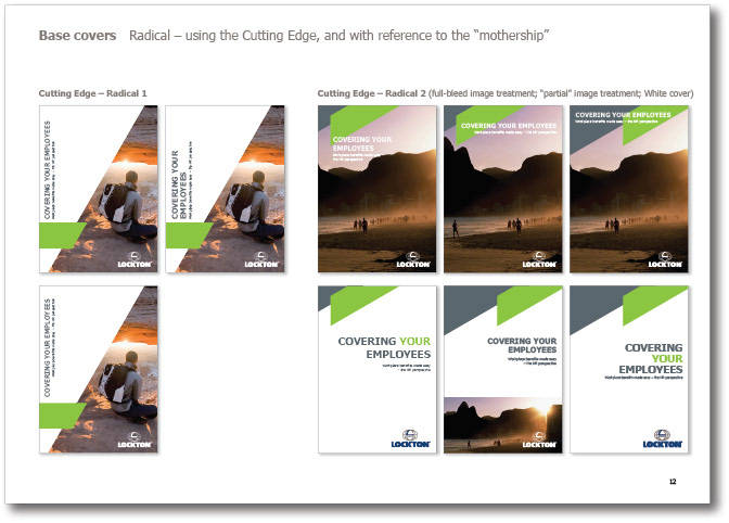
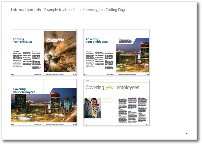
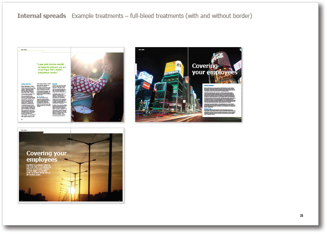
The brief for Lockton's brand refresh was to provide guidelines for multiple document types, and a series of good practice examples to be used for inspiration. These were to reference some elements from the current, confused brand, but bring consistency and a fresh, personable approach. We took one of the more successful, simple and readily identifiable VI elements and used it for inspiration (see below). I then produced conservative, radical and middle ground design options — as well as internal spreads, grids, typography and many other aspect of a refreshed VI.